Vehicles
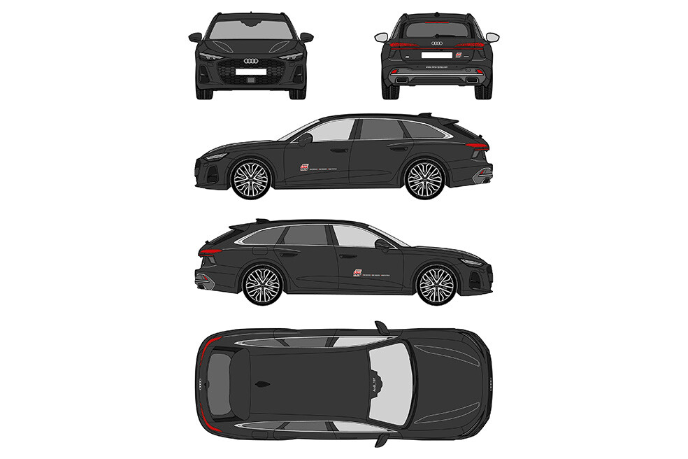
Vehicles | Passenger Cars
The REMA TIP TOP passenger cars are labeled on both the driver and passenger sides with RTT logos including the claim (width: 606 mm).
The logo placement on the door panels is centered between the left and right door edges. The vertical positioning depends on the specific vehicle model. The logo must not be applied across deep body grooves. It must be placed above existing body lines and aligned visually straight, following the contour of the bodywork.
The rear labeling consists of a discreet RTT logo without claim, 78 mm in height, along with a website address. The deliberately small logo size ensures flexible placement on the rear areas of all common vehicle models, preferably to the right of the license plate.
The website address is set in the font Pill Gothic Regular. Its height is defined as 20 mm based on the “www” characters and is placed centered below the license plate or on the bumpers.
The plotted lettering may only be produced in white or black. The color choice depends on the vehicle color. Approved vehicle colors are white, silver, shades of gray, and black.
As a general rule: on light backgrounds (white, silver, light gray), black lettering must be used. On black or very dark vehicles, white lettering must be applied.
Note: Shades of gray can vary greatly in brightness. In case of doubt, the appropriate lettering color should be determined on site.
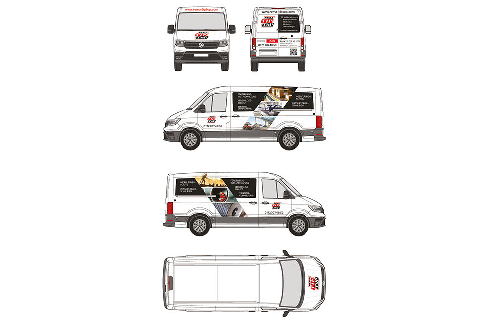
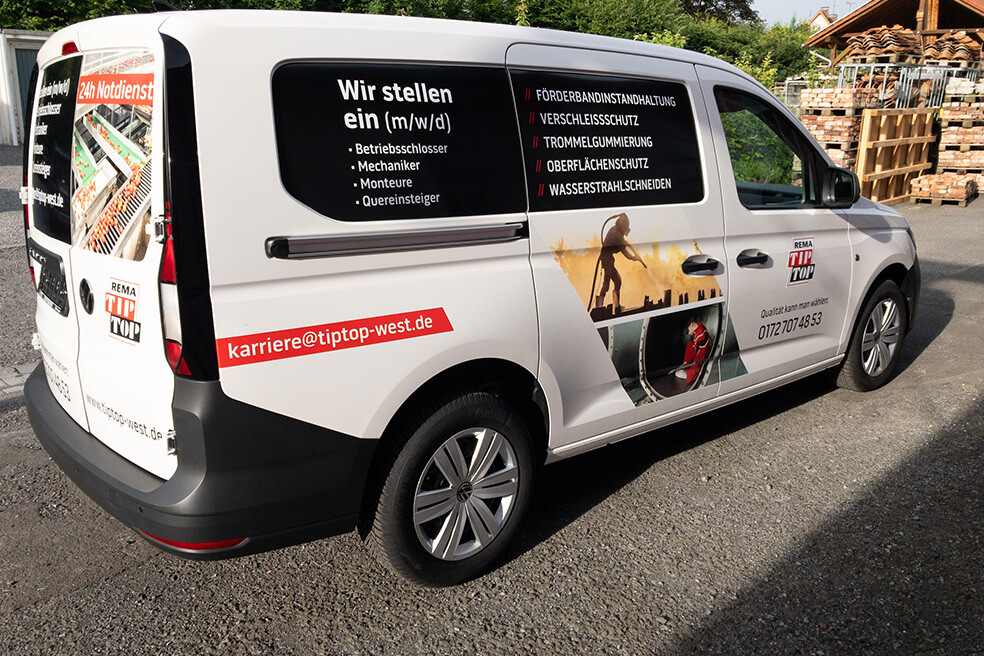
Vehicle | Commercial Vehicles
The REMA TIP TOP design is applied to all types of commercial vehicles.
Example representation – commercial vehicles
One of the most frequently used commercial vehicles is the VW Crafter, shown here as an example.
Vehicle color
REMA TIP TOP commercial vehicles should always be white.
If vehicles are in a different color, all design elements must be adjusted depending on the background color, switching from black lettering to white lettering where required.
Logo
The logo may be used with or without the claim. If a bold vehicle wrap with extensive imagery is chosen, the claim may be omitted for space reasons.
Lettering
The font used is Pill Gothic Regular, black – and white on black or very dark backgrounds.
The font size depends on the available area to be labeled.
Keywords representing the service portfolio are set in uppercase on the vehicle sides and rear, as shown in the application example, and separated by the middledot glyph.
Address details may be placed on the driver’s doors and on the rear of the vehicle. The selection of address components and any additional information is flexible (e.g. inclusion of a service hotline).
If numbers or codes must be applied to vehicle roofs due to operational requirements, they must be installed in the specified sizes. The font used here is also Pill Gothic Regular, black.
Important: Commercial vehicle lettering is subject to heavy wear. Therefore, high-quality film material must be used. Installation must be carried out exclusively by qualified professionals.