Colors
Colors are an essential element of any design. They provide orientation and create a sense of structure. A concise color scheme is the most important basis for recognition value. The REMA TIP TOP design is essentially based on the concise use of the logo colors black and REMA TIP TOP red.
The color spectrum is extended by basic and accent colors, which can be used to create structure on the one hand and to direct attention on the other. The basic colors are used when areas with text content, such as larger info boxes in brochures, are highlighted. They can also be used to underline the backgrounds of presentation slides. When used in this way, the areas can remain empty or be filled with content.
Accent colors are used to highlight information. They are always used at 100% saturation. Higher saturation levels are only used for illustrations or graphics. Characteristic of the REMA TIP TOP design is that the colors are accentuated by large amounts of white space. The luminosity and presence of the images are also enhanced by a correspondingly white-rich environment.
This combination of a high amount of white space and the REMA TIP TOP colors characterizes the brand’s recognition value and ensures a clear association of the products and services with REMA TIP TOP, especially in contrast to the competition. For this reason, white, black, REMA TIP TOP red, REMA TIP TOP dark grey and REMA TIP TOP medium grey are defined as the logo and basic colors of the REMA TIP TOP design. These colors must dominate the appearance of all REMA TIP TOP documents and objects!
REMA TIP TOP blue, REMA TIP TOP green, REMA TIP TOP yellow and REMA TIP TOP red are defined as REMA TIP TOP accent colors. These colors are mainly used in packaging design and are therefore quickly and accurately associated with REMA TIP TOP products by the customer.
Please note: The attention-grabbing effect is lost through the inflationary use of accent colors. They should therefore only be used very carefully. Particular care should be taken when combining them with images! Only one accent color may be used per document or per object. The following pages define the REMA TIP TOP color scheme including the permitted color gradations.
Colors | Primary & base colors
Colors | Accent colors for packaging design
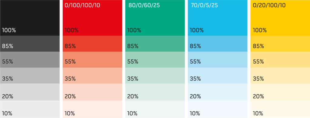
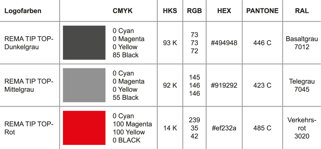
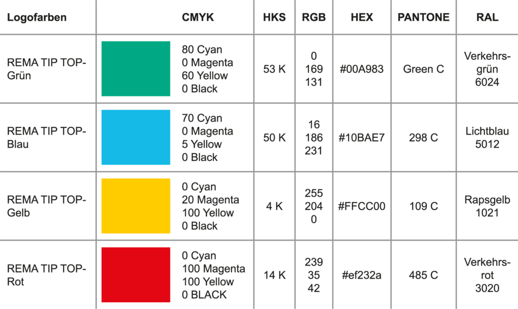
The REMA TIP TOP color scheme has long been established worldwide – thanks to a consistent design with a strong dominance of the logo colors and the broad use of accent colors in product and packaging design. In its versatility, the color scheme offers the possibility of creating numerous desired moods and effects without the design losing its connection to the company and its products. However, care must always be taken to use sufficient white space and harmonious color coordination, especially in combination with imagery, to maintain the effect of the particular use of color.